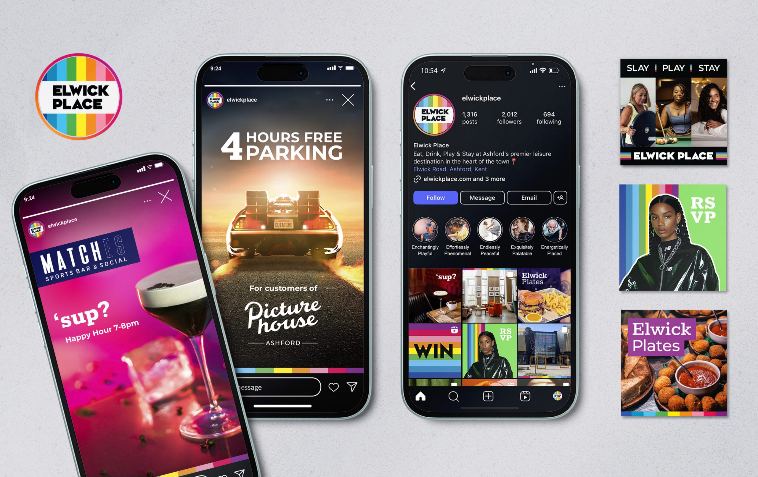
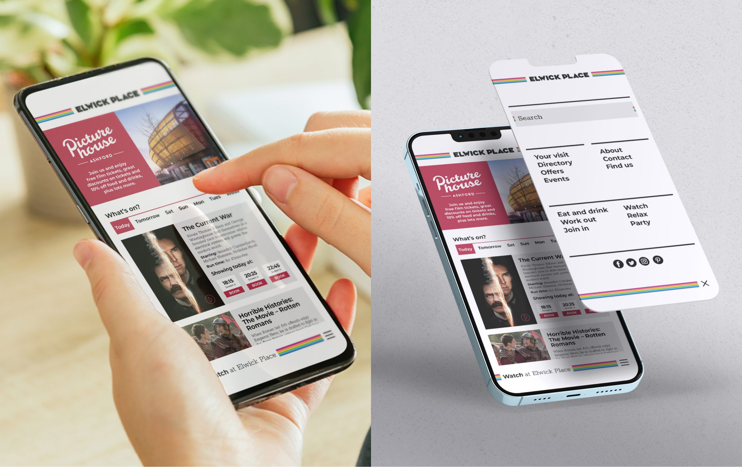
To engage the people of Ashford and surrounding areas to see Elwick Place (a development with a hotel, bars, restaurants and cinema) as a premier hotspot for leisure activities and drive footfall across all demographics.
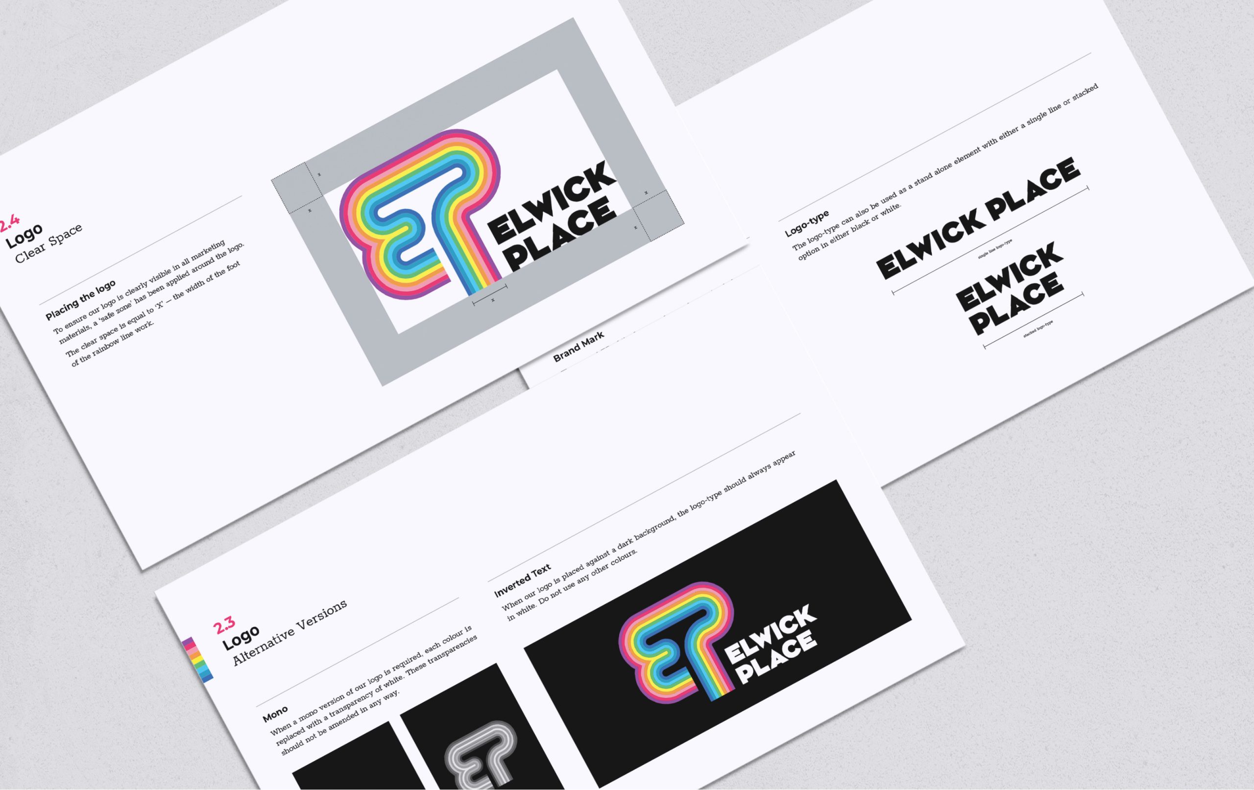
Inspired by the heritage of the Letraset font foundry, Ashford’s major transport links the Ash trees from which it got it’s name, the EP of the logo can stand alone as a tree shape. Just as trees lay down their roots to survive, Elwick Place laying roots for the community to come together and thrive.
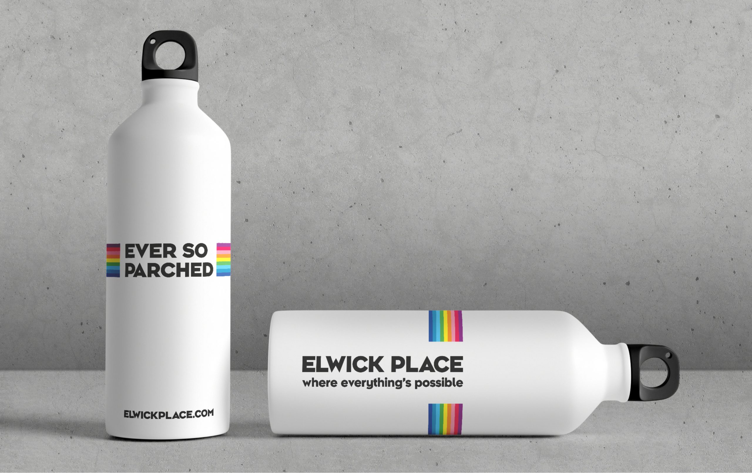
Within the guidelines, I developed a tone of voice that is inviting and exciting. The tone is always light and alludes to interaction and enjoyment. A play on the E and P of Elwick Place led me to create a strapline for each of the leisure sectors within the complex.
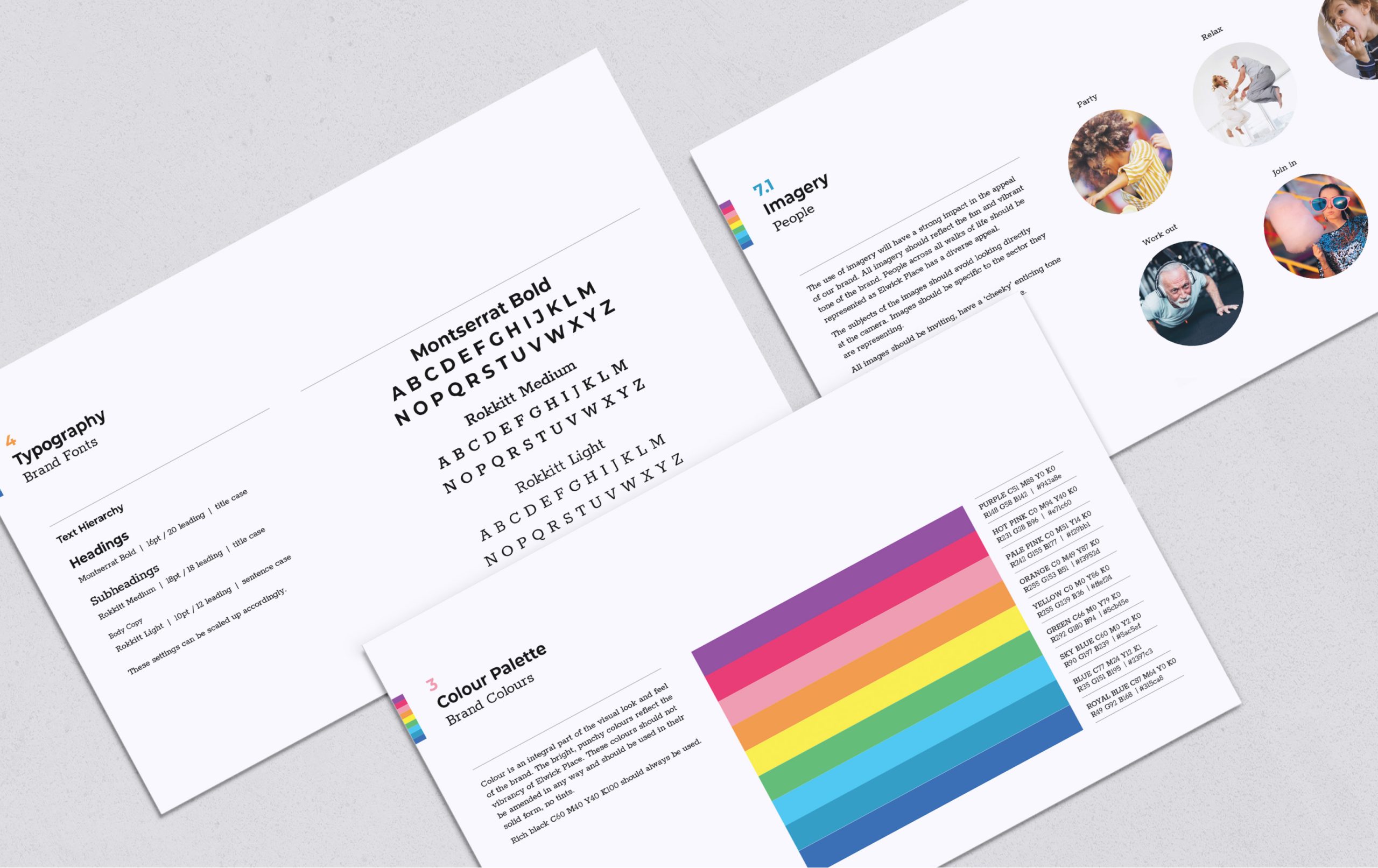
Colour is an integral part of the visual look and feel of the brand, reflecting the vibrancy of Elwick Place. Each sector was assigned a colour for signposting purposes – an easy identifier to the end user.