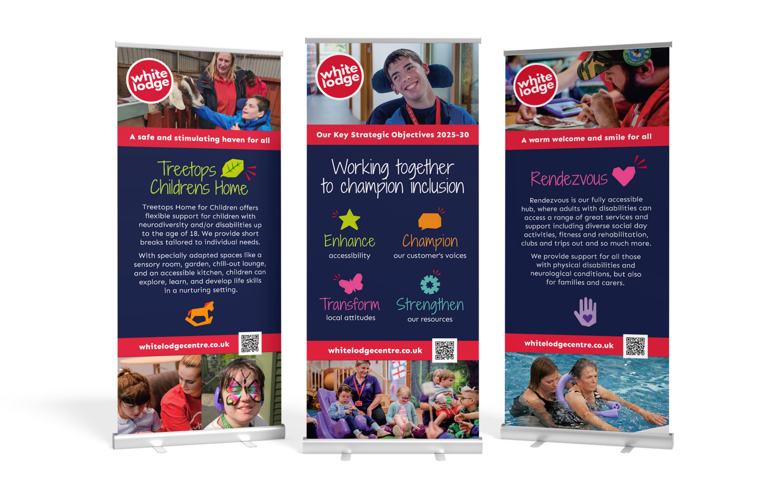
White Lodge Centre is a Surrey based charity providing services that enable those with a range of disabilities, their families and carers to lead fulfilling lives.
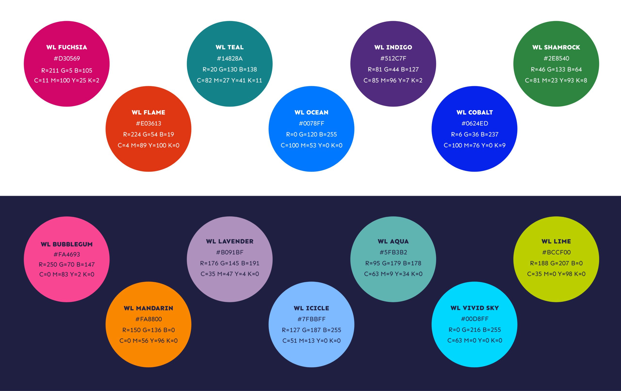
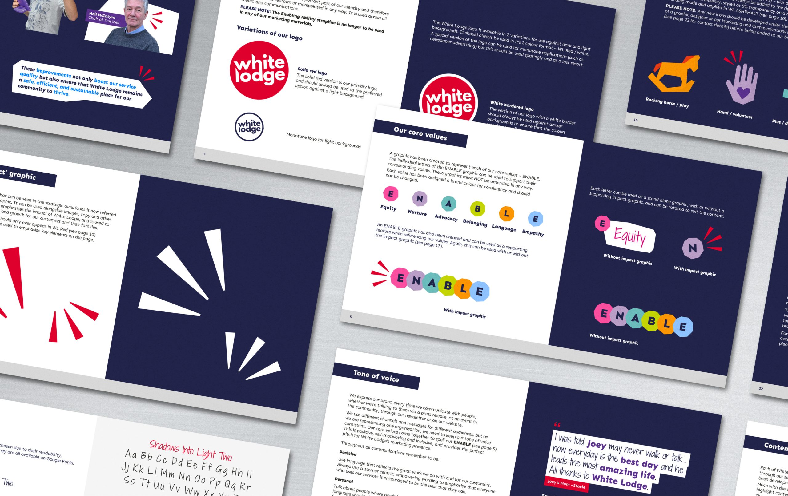
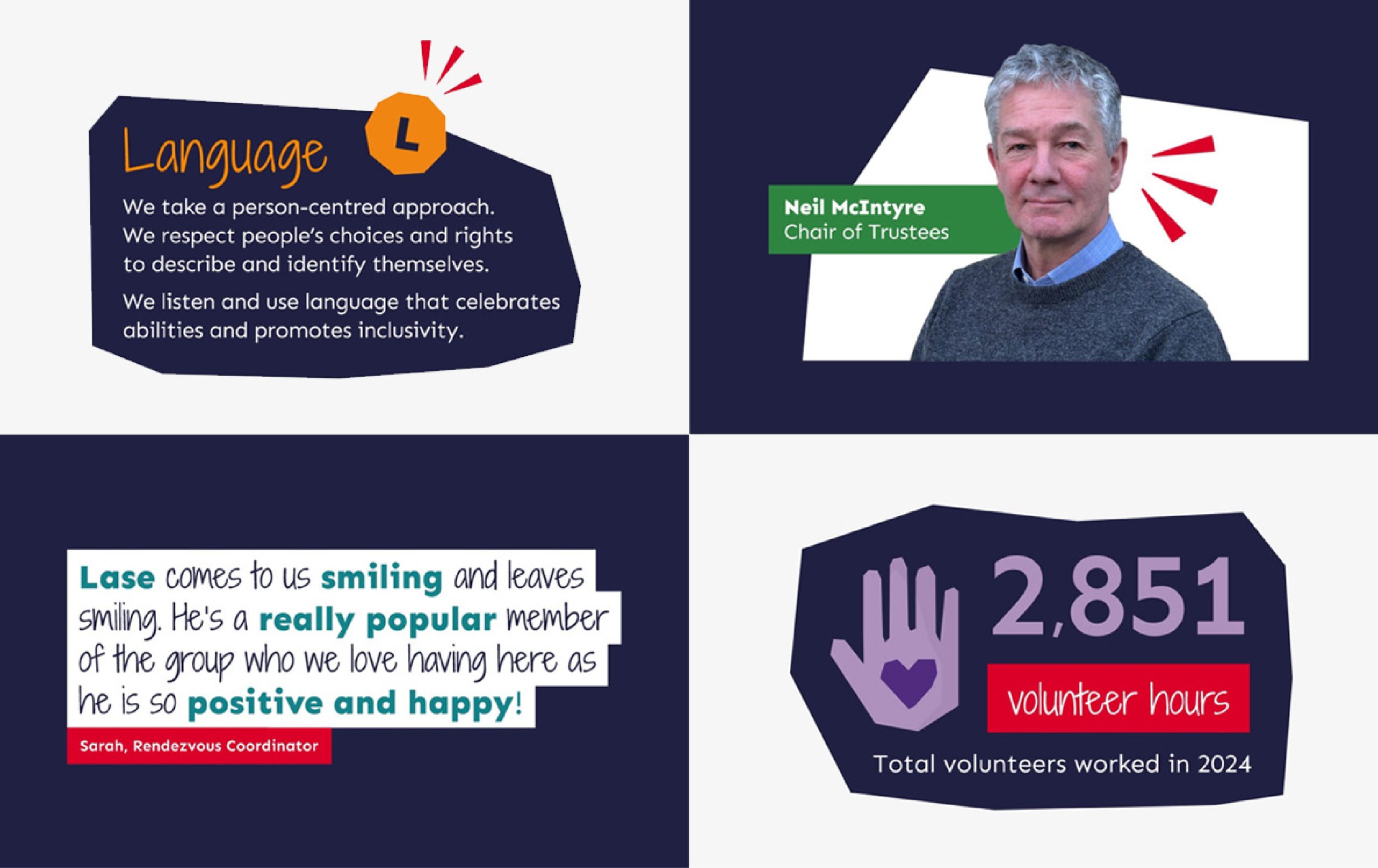
After extensive research, I generated a brand colour palette. All colours are suitable for individuals with sensory needs and compliant to WCGA AA accessibility standards. I created an impact graphic to be used alongside images, copy and icons. It was created to emphasise the impact of White Lodge, and is used to symbolise movement and growth.
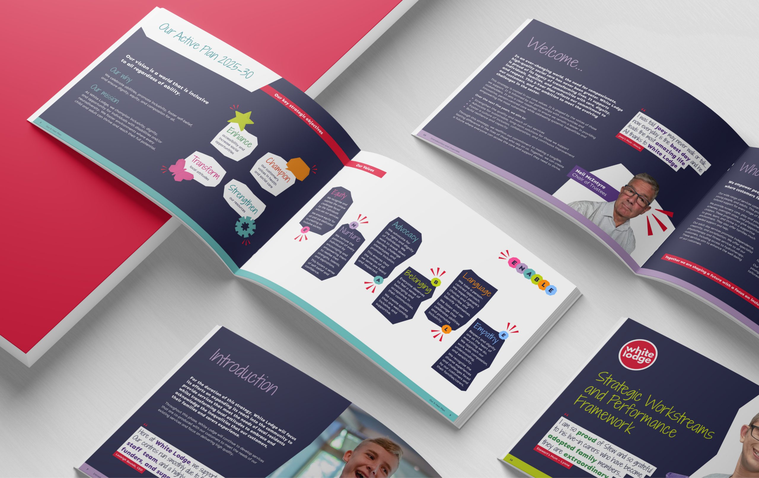
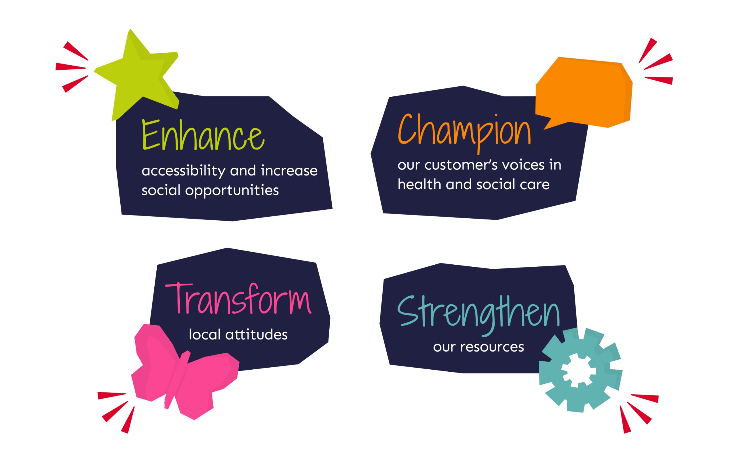
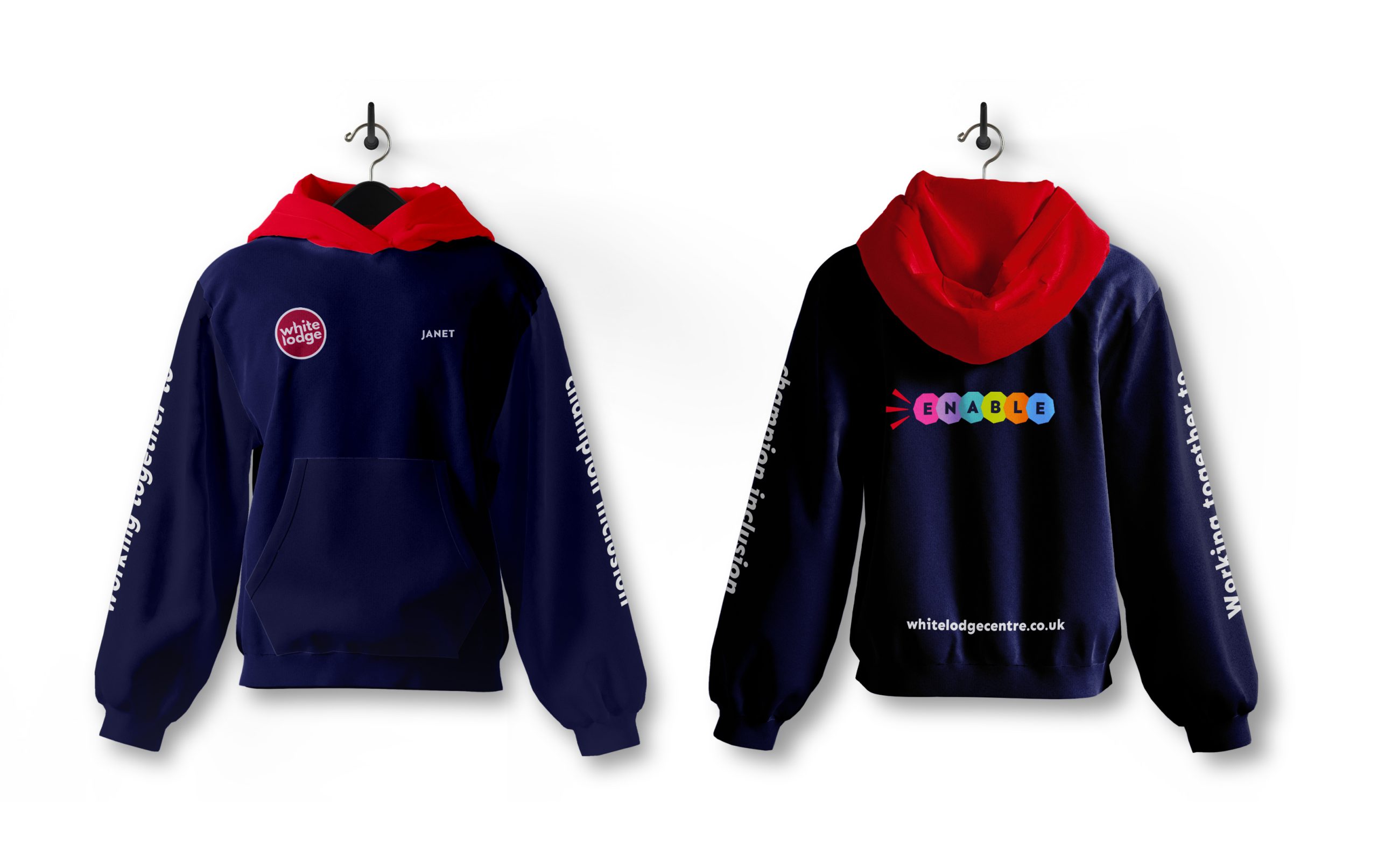
I also developed a set of icons to highlight the key strategic objectives that will carry the brand through 2025-2030, and also a variety of supporting icons/icon style to highlight key facts and figures, events and services.
The new look and feel made the CEO cry happy tears when she first saw it.